
Fashion and wearables · Discovery
Visual readingChronograph Watch
A watch face that turns a small circle into a crowded map of time.
Summary
A watch face that turns a small circle into a crowded map of time.
Reading status
A visual reading of a chronograph type, not a model authentication, valuation, accuracy test, or condition report.
At a glance
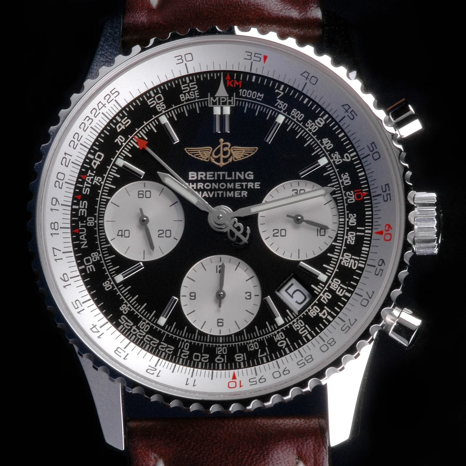
A watch with multiple sub-dials, pushers, a marked bezel or scale, and a dense hierarchy of small information.
- Subject
- Chronograph watch
- Period
- 20th-century reference
- Materials
- Steel, glass, strap
- Setting
- Wearable design reference
Visible evidence
Why it matters
A chronograph makes visual hierarchy visible. The face must hold ordinary time and additional timing functions without losing the eye.
Visible evidence
Look closer
Three details to carry with you.
- 01
Separate the main hands from the smaller sub-dials.
- 02
Find the scale that seems intended for speed, distance, or elapsed time.
- 03
Notice how the pushers and crown extend the dial's graphic system into the case.
Documented context
How it was made
Metal case · Glass crystal · Printed dial and sub-dials
Documented context
Story and context
Chronograph watches combine timekeeping with stopwatch functions, producing a visual language of scales, markers, and controls.
Documented context
Culture and context
The busy face is often read as technical sophistication. Looking closely asks whether the information is actually organised for use or simply performs precision.
Documented context
Honest facts
Keeping certainty visible.
- A photo cannot verify the movement, model, accuracy, originality, or condition.
- This page does not provide technical, financial, or repair guidance.
Interpretation
Interpretation
One way to read it.
The watch feels like a miniature instrument panel. Its promise is not silence but controlled information.
Another reading
The density can make the object feel less usable. Perhaps the watch is designed as much to be read by others as by its wearer.
This example follows the same order as an Art Says Hi result. Visible details come first, documented context comes next, and interpretation stays clearly marked.
Take another look
What is the first piece of information your eye can find? Let the dial's hierarchy answer before its brand or price.
Upload a photoSources
Follow the sources, then return to the image. Some links lead to a collection or publisher website.
Image credits
Breitling Navitimer chronograph watch.jpg
Torsten Bolten (opens in a new tab)CC BY-SA 3.0 (opens in a new tab)
Resized and converted to WebP for local delivery; composition otherwise unchanged.