
Designed objects · Discovery
Visual readingLondon Red Telephone Box
A small public room where colour, lettering, and repetition make a piece of infrastructure memorable.
Summary
A small public room where colour, lettering, and repetition make a piece of infrastructure memorable.
Reading status
A visual reading of a public design object, not a model, ownership, condition, or service-status check.
At a glance
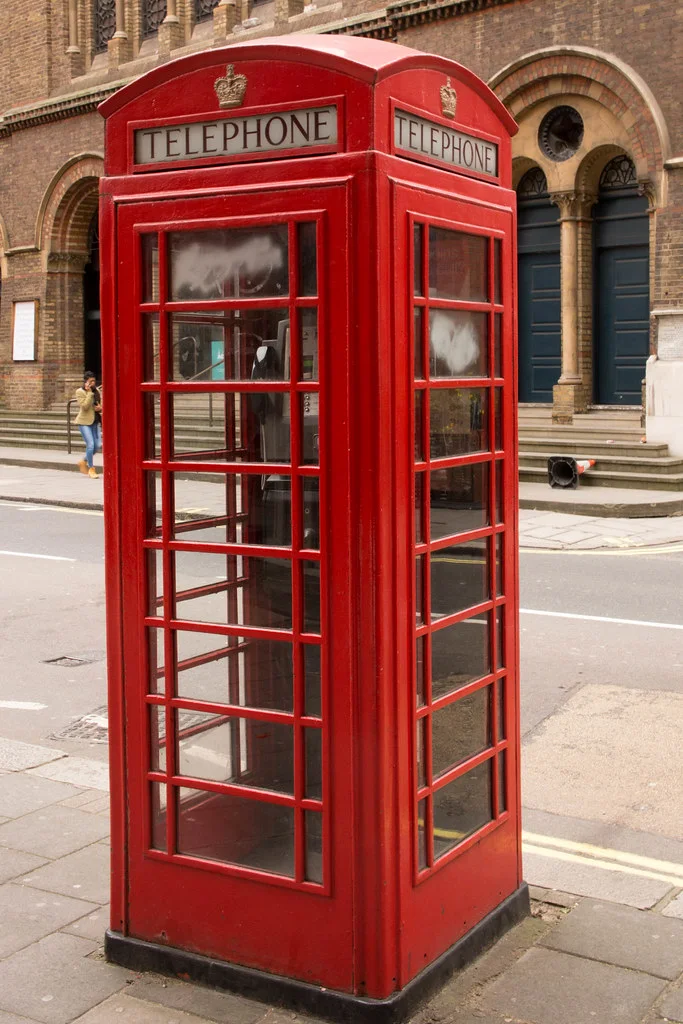
A freestanding red kiosk with repeated glass panes, a domed top, and a strong crown of lettering.
- Design lineage
- Giles Gilbert Scott
- Period
- 1930s K6 reference
- Materials
- Cast iron, glass, paint
- Setting
- London streetscape
Visible evidence
Why it matters
The telephone box shows how a practical object becomes cultural scenery. Its colour and repeated windows make it readable from a distance and intimate up close.
Visible evidence
Look closer
Three details to carry with you.
- 01
Trace the vertical grid of panes and the horizontal bands around the box.
- 02
Notice how the dome and crown give a small object civic presence.
- 03
Compare the vivid red with the changing street around it.
Documented context
How it was made
Cast iron panels · Glass panes · Painted signage and crown
Documented context
Story and context
The K6 design was introduced in the 1930s and became a widely recognised part of British public infrastructure.
Documented context
Culture and context
Many boxes no longer work as telephones, but the form remains active as a visual sign of place, memory, and public access.
Documented context
Honest facts
Keeping certainty visible.
- A photo cannot verify the model, original function, or current status of a particular box.
- The page does not claim ownership, preservation status, or safety condition.
Interpretation
Interpretation
One way to read it.
The box feels like a miniature building because its colour and proportions make public infrastructure act like architecture.
Another reading
Its strong identity can also feel nostalgic. The object may be remembered more clearly than it is actually used.
This example follows the same order as an Art Says Hi result. Visible details come first, documented context comes next, and interpretation stays clearly marked.
Take another look
What gives the box its identity first: the red, the grid, the dome, or the lettering?
Upload a photoSources
Follow the sources, then return to the image. Some links lead to a collection or publisher website.
Image credits
Iconic London Red Telephone Box
chipgriffin (opens in a new tab)CC BY 2.0 (opens in a new tab)
Resized and converted to WebP for local delivery; composition otherwise unchanged.