
Food, print and everyday culture · Flagship
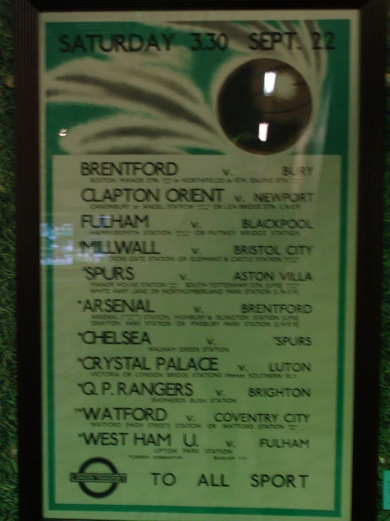
Visual readingLondon Underground Poster
A poster that turns a route, a place, or a season into a reason to move through the city.
Summary
A poster that turns a route, a place, or a season into a reason to move through the city.
Reading status
A visual reading of a poster type, not a precise edition identification or a claim that the image is cleared for reuse.
At a glance
A bold printed composition where image, lettering, colour, and the Underground identity organise a public invitation.
- Design lineage
- London Underground poster designers
- Period
- 20th-century reference
- Materials
- Printed paper and ink
- Setting
- Graphic design reference
Visible evidence
Why it matters
The Underground poster is a portable piece of place-making. It does not just describe London; it edits the city into a mood someone might choose to enter.
Visible evidence
Look closer
Three details to carry with you.
- 01
Separate the headline, image, and route or place cues.
- 02
Notice how colour does the work of urgency, distance, or season.
- 03
Look for the points where typography becomes part of the illustration.
Documented context
How it was made
Printed paper · Ink and graphic lettering · Illustration, photography, or map-like forms
Documented context
Story and context
London Underground posters developed through collaborations between transport authorities, artists, designers, and printers across the twentieth century.
Documented context
Culture and context
The posters are often collected as art, but their first life was practical: helping a transport network sell movement, attention, and possibility.
Documented context
Honest facts
Keeping certainty visible.
- A photo cannot establish the exact poster edition, printer, date, or paper condition without a catalogue record.
- The example is about graphic language, not advertising affiliation or copyright clearance for reuse.
Interpretation
Interpretation
One way to read it.
The poster makes travel feel like a visual decision. It turns a timetable's destination into an atmosphere.
Another reading
The invitation can also feel directive. The poster does not merely show a place; it tells the viewer what kind of person might want to go there.
This example follows the same order as an Art Says Hi result. Visible details come first, documented context comes next, and interpretation stays clearly marked.
Take another look
What makes the poster persuasive first: image, colour, words, or the promise of a destination?
Upload a photoSources
Follow the sources, then return to the image. Some links lead to a collection or publisher website.
Image credits
London Underground poster
Ben Sutherland (opens in a new tab)CC BY 2.0 (opens in a new tab)
Resized and converted to WebP for local delivery; composition otherwise unchanged.