
Designed objects · Discovery
Design referencePenguin Tri-Band Paperback
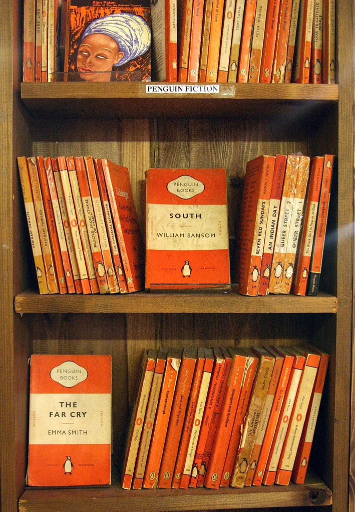
A paperback whose orange bands turn a shelf of books into a visual system.
Summary
A paperback whose orange bands turn a shelf of books into a visual system.
Reading status
A graphic design reference and visual reading, not an edition, value, or condition assessment.
At a glance
A compact paperback cover organised around horizontal colour bands, typography, and a small publisher mark.
- Design tradition
- Penguin Books
- Period
- 1930s onward reference
- Materials
- Printed paper, ink, binding
- Setting
- Book and graphic design reference
Visible evidence
Why it matters
The Penguin paperback shows how a repeatable graphic rule can make thousands of different titles feel like a family.
Visible evidence
Look closer
Three details to carry with you.
- 01
Find the horizontal bands before reading the title.
- 02
Compare the type hierarchy with the small publisher device.
- 03
Imagine the single book beside many others and notice how repetition scales the design.
Documented context
How it was made
Printed paper · Ink and typography · Paperback binding
Documented context
Story and context
Penguin's early paperbacks used a consistent cover system to make inexpensive books legible, portable, and recognisable across a growing list.
Documented context
Culture and context
The design is important not because one cover is precious, but because a publishing identity becomes a public visual language.
Documented context
Honest facts
Keeping certainty visible.
- The image is a licensed photograph of a Penguin book example and does not verify a particular edition or jacket condition.
- The page discusses graphic design, not copyright status of every individual title.
Interpretation
Interpretation
One way to read it.
The cover feels confident because it reduces choice. A small set of rules gives difference somewhere to appear.
Another reading
The system can also feel restrictive. When every book belongs to the same family, the individual title must work harder to become distinct.
This example follows the same order as an Art Says Hi result. Visible details come first, documented context comes next, and interpretation stays clearly marked.
Take another look
What do you notice first when you ignore the words: colour, proportion, or the publisher mark?
Upload a photoSources
Follow the sources, then return to the image. Some links lead to a collection or publisher website.
Image credits
Penguin Fiction
Martin Burns (opens in a new tab)CC BY 2.0 (opens in a new tab)
Resized and converted to WebP for local delivery; composition otherwise unchanged.