
Food, print and everyday culture · Discovery
Visual readingVintage Travel Poster
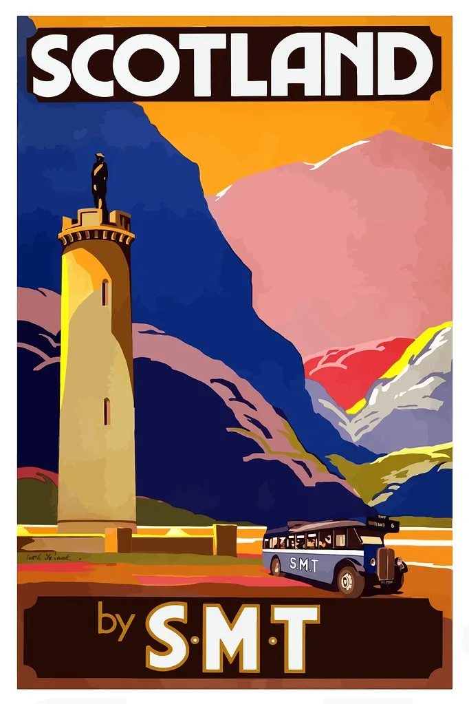
A printed promise that compresses a landscape into colour, type, and one memorable shape.
Summary
A printed promise that compresses a landscape into colour, type, and one memorable shape.
Reading status
A visual reading of a travel-poster type, not a precise cataloguing, edition, or historical provenance claim.
At a glance
A vertical poster that combines a destination cue, simplified landscape, bold colour, and a short verbal invitation.
- Subject
- Vintage travel poster
- Period
- 20th-century reference
- Materials
- Printed paper, ink, illustration
- Setting
- Graphic design reference
Visible evidence
Why it matters
A travel poster is a small machine for making elsewhere feel near. It uses visual shortcuts, but those shortcuts also reveal what a culture chooses to sell as a place.
Visible evidence
Look closer
Three details to carry with you.
- 01
Find the single shape that carries the destination.
- 02
Compare the scale of the lettering with the illustrated scene.
- 03
Notice which colours make the place feel warm, remote, modern, or historic.
Documented context
How it was made
Printed paper · Flat colour and ink · Illustration and typography
Documented context
Story and context
Travel posters grew alongside railways, steamship routes, airlines, tourism offices, and commercial print culture.
Documented context
Culture and context
The poster is not a neutral window onto a destination. It is a designed version of a place, shaped by travel, commerce, and expectation.
Documented context
Honest facts
Keeping certainty visible.
- A generic vintage poster cannot prove its original commission, date, destination, or print run without cataloguing.
- The CC0 image is a visual reference; page copy does not imply a museum or tourism-board connection.
Interpretation
Interpretation
One way to read it.
The poster makes distance feel manageable by turning a place into one clear visual promise.
Another reading
The simplification can feel seductive or uncomfortable. What disappears from the picture may be as important as what remains.
This example follows the same order as an Art Says Hi result. Visible details come first, documented context comes next, and interpretation stays clearly marked.
Take another look
What has been removed to make the destination feel instantly recognisable?
Upload a photoSources
Follow the sources, then return to the image. Some links lead to a collection or publisher website.
Image credits
Vintage-Travel-Poster-Scotland
Halloween HJB (opens in a new tab)CC0 1.0 (opens in a new tab)
Resized and converted to WebP for local delivery; composition otherwise unchanged.