
Food, print and everyday culture · Discovery
Visual readingClassic Diner Menu
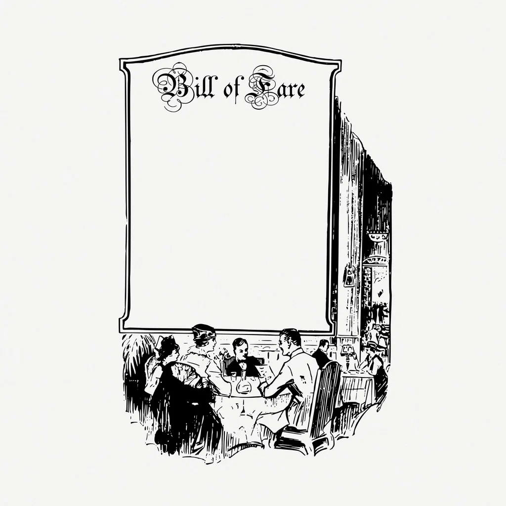
A menu that turns choosing lunch into a small theatre of lettering, borders, and imagined abundance.
Summary
A menu that turns choosing lunch into a small theatre of lettering, borders, and imagined abundance.
Reading status
A visual reading of menu design, not a restaurant identification, food-safety opinion, price claim, or historical provenance record.
At a glance
A decorative menu surface with a framed composition, large lettering, food cues, and a promise of choice.
- Subject
- Classic diner menu
- Period
- 20th-century reference
- Materials
- Printed paper or card, ink
- Setting
- Graphic design reference
Visible evidence
Why it matters
A diner menu is an everyday page that performs hospitality. It has to make food imaginable before the kitchen makes it real.
Visible evidence
Look closer
Three details to carry with you.
- 01
Find the menu's strongest frame or border.
- 02
Compare the type used for names, prices, and promises.
- 03
Notice how illustrations make food feel available without showing the actual plate.
Documented context
How it was made
Printed paper or card · Ink and illustration · Binding, laminate, or worn edges
Documented context
Story and context
Restaurant menus combine practical information with local graphic language, changing with printing methods, prices, dishes, and the identity of a place.
Documented context
Culture and context
The menu sits between archive and performance. It records what a place wanted to offer while also shaping what diners expected to feel.
Documented context
Honest facts
Keeping certainty visible.
- The CC0 image is a vintage menu illustration, not evidence of one diner, menu date, price, or restaurant.
- The page does not judge food quality, safety, or authenticity from the design.
Interpretation
Interpretation
One way to read it.
The menu feels abundant because its typography turns a list into a scene of possibility.
Another reading
The abundance can also feel overwhelming. More choice does not always make the decision easier; it can make the menu perform hospitality as excess.
This example follows the same order as an Art Says Hi result. Visible details come first, documented context comes next, and interpretation stays clearly marked.
Take another look
What makes the menu feel welcoming: the border, the names, the pictures, or the promise of choice?
Upload a photoSources
Follow the sources, then return to the image. Some links lead to a collection or publisher website.
Image credits
Vintage diner menu
Rawpixel public domain image (opens in a new tab)CC0 1.0 (opens in a new tab)
Resized and converted to WebP for local delivery; composition otherwise unchanged.