
Food, print and everyday culture · Discovery
Visual readingMatchbox Label
A tiny printed surface where a few colours and a small emblem have to carry a whole promise.
Summary
A tiny printed surface where a few colours and a small emblem have to carry a whole promise.
Reading status
A visual reading of a matchbox-label type, not a catalogue, rarity, safety, or value assessment.
At a glance
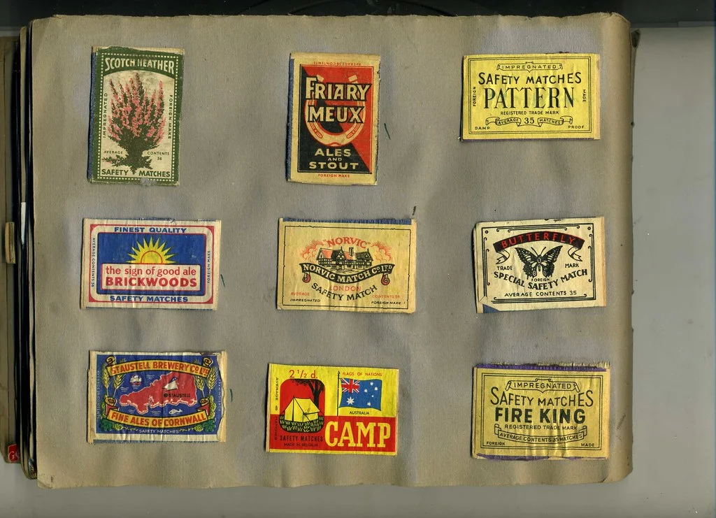
A small label with a compact image, brand lettering, border, and a field of colour designed to be read at close range.
- Subject
- Matchbox label
- Period
- 20th-century reference
- Materials
- Printed paper, ink, card or wood
- Setting
- Graphic design reference
Visible evidence
Why it matters
The matchbox label is graphic design under pressure. Its surface is small, but it still has to signal use, identity, and sometimes a whole imagined world.
Visible evidence
Look closer
Three details to carry with you.
- 01
Find the border and see how it contains the image.
- 02
Compare the scale of lettering with the central emblem.
- 03
Notice how colour helps the label survive beside many others.
Documented context
How it was made
Printed paper label · Ink and colour blocks · Cardboard or wood packaging
Documented context
Story and context
Matchbox labels became collectible graphic objects as manufacturers used small packages to build recognition and visual variety.
Documented context
Culture and context
The label sits between advertisement, instruction, and miniature poster. Its smallness encourages close looking rather than distance.
Documented context
Honest facts
Keeping certainty visible.
- A photo cannot prove the original date, maker, print run, or rarity of one label.
- The page does not make collectible-value claims.
Interpretation
Interpretation
One way to read it.
The label feels lively because it has very little room to waste. Every border and colour has to work.
Another reading
Its compactness can also make it feel secretive. The image may be less a public message than a small object held close to the hand.
This example follows the same order as an Art Says Hi result. Visible details come first, documented context comes next, and interpretation stays clearly marked.
Take another look
What survives when the label is reduced to a tiny rectangle: image, colour, name, or border?
Upload a photoSources
Follow the sources, then return to the image. Some links lead to a collection or publisher website.
Image credits
Early collecting - matchbox labels c 1961
sludgegulper (opens in a new tab)CC BY-SA 2.0 (opens in a new tab)
Resized and converted to WebP for local delivery; composition otherwise unchanged.