
Guide · Style labels
'Art deco', 'Bauhaus', 'mid-century': what the style labels actually point at
Marketplace listings stretch style labels until they mean 'looks nice'. The three words below have real visual signatures — and real objects to test them against.
Open any marketplace or auction listing and the style labels appear like seasoning: 'art deco mirror', 'mid-century sideboard', 'Bauhaus lamp'. Used that loosely, the words only mean 'looks a bit vintage'. They started as names for specific movements with dates, places, and a set of visual choices you can actually check.
This guide gives the three commonest labels their signatures, and anchors each to a documented example in the site's library. A label is always a claim about an object; the object is the evidence.
Why style labels get stretched
Style words decay in use. Each began attached to a movement — a school, an exhibition, a generation of makers — and each is now routinely borrowed for anything that rhymes with it: zigzags become 'deco', tapered legs become 'mid-century'. The borrowing is not always cynical; the labels spread because they are genuinely useful shorthand.
The correction is boring and effective: pin the word back to the period and the characteristics that made it a term in the first place. Museum glossaries do exactly that — Tate's art terms define movements by date and character, and the V&A's collection pages group real objects under each name. A seller's label is the loose version; the collection record is the tight one.
Art deco: geometry, speed, surface
Tate defines art deco as a design style of the 1920s and 1930s across furniture, decorative arts and architecture, characterised by its geometric character — and names it after the 1925 Paris exhibition, the Exposition Internationale des Arts Décoratifs et Industriels Modernes. It followed — and partly reacted against — the flowing, plant-like curves of art nouveau; the V&A describes deco's own blend of 'tradition and progress': handcraft luxury beside machine-age celebration, running from the roaring twenties into the Depression.
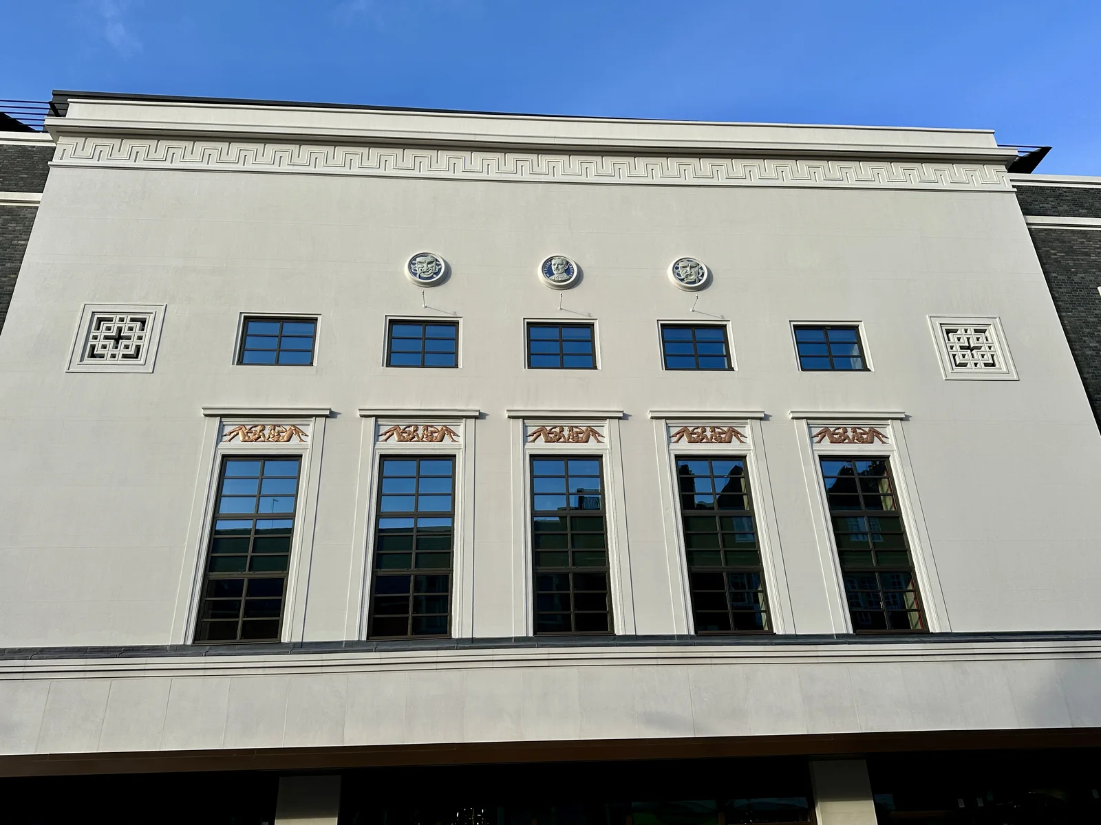
What to look for: stepped and ziggurat profiles, sunburst and fan motifs, zigzag and chevron ornament, streamlined curves. Tate notes deco drew on modern transport — ships, trains, motor cars — as well as ancient Egyptian and Central American art. Surfaces are polished and often exotic: chrome, glass, lacquer.
See it in the library's art deco cinema facade: the label earns its keep in the symmetry, the stylised relief, and the sense that the building is moving while standing still.
Bauhaus: the workshop made visible
Bauhaus is the tightest of the three labels — a real school. Walter Gropius founded it at Weimar in 1919; it moved to Dessau in 1925 and closed under Nazi pressure in 1933. Tate's glossary stresses its social aim: dissolve the boundary between fine art and everyday life by putting architecture, design and applied art on equal footing.
Dessau's own building is the best document of what that looked like. The Bauhaus Dessau Foundation describes the 1926 complex as a deliberate demonstration: parts with separate functions vary in size and height, a two-storey bridge — the administrative headquarters — connects the glazed workshop wing with the north wing, which housed the vocational technical school, while the five-storey studio building joins through a separate one-storey segment, and Gropius's own specification lists honest modern material — a concrete frame, profile-iron windows with plate glass, cement plaster. The building has no single frontal view; you read it by walking around it.
What to look for: unornamented cubic volumes, flat roofs, curtain walls of glass, tubular steel, visible structure. If a 'Bauhaus' lamp arrives covered in decoration, the label is doing marketing, not description. Compare with the Bauhaus Dessau example.
Mid-century: optimism in plywood and plastic
'Mid-century' is the loosest of the three — a market period label more than a movement with a manifesto. It generally points to furniture and product design from the 1940s through the 1960s: organic curves, tapered and splayed legs, and new materials such as moulded plywood and fibreglass put to mass production.
The anchor object is the Eames lounge chair — moulded plywood shells, aluminium and leather, designed by Charles and Ray Eames and documented in the Vitra Design Museum's collection, which records the design period as 1943–1956. Our Eames lounge chair example shows the type: comfort engineered through process rather than ornament.
Because the label is loose, it stretches furthest — anything wooden and vaguely retro qualifies on a listing. The check is materials and construction, not silhouette alone.
What labels get wrong on listings
A style label is a seller's claim — never authentication, and not dating. 'Art deco' on a 1980s mirror means zigzag decoration; 'mid-century' on a new sideboard means tapered legs. The label tells you which decade the seller wants the object to evoke.
The honest version of the check: ask what the object is made of, how it was made, and whether any marks or a maker's record back the label — the marks guide covers signatures, stamps and edition numbers as evidence. A visual style match can narrow the search; it cannot date the piece.
A useful counter-example sits in our own library: the original iMac G3 is translucent-plastic product design from 1998 — 'space-age' on a listing, yes; 'mid-century', no. Seeing the labels used wrongly is part of learning them.
One example per label, from the library
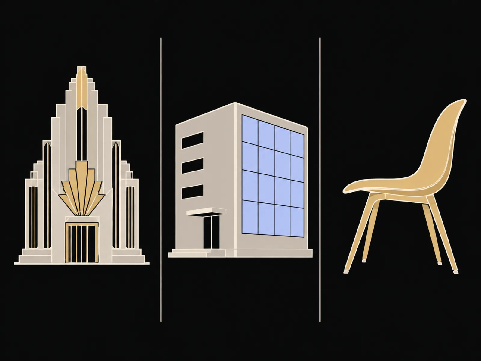
Three labels, three documented objects to test them on: the art deco cinema facade for geometry and stylised relief, the Bauhaus building at Dessau for workshop-made-visible form, and the Eames lounge chair for what moulded-plywood optimism looks like in a product.
Then run the check in the other direction. Photograph the labelled object from a listing or a shelf — the scanner's AI-generated, provisional reading describes the visible evidence — and compare its style language with the label: does the object show the signatures, or only the word?
Take another look
The next listing you meet with a style word in it, read the word as a claim. The object's materials, construction and marks are the evidence — and an AI-generated reading can help you list them, provisionally, as a draft to check against the object.
Sources
- Tate, art term: Art deco (opens in a new tab)
- V&A, Art Deco collection (opens in a new tab)
- Tate, art term: Bauhaus (opens in a new tab)
- Bauhaus Dessau, the building (opens in a new tab)
- Vitra Design Museum, collection record: Eames Lounge Chair (opens in a new tab)
Style definitions follow the Tate glossary, the V&A and the Bauhaus Dessau Foundation; the listing-label cautions are Art Says Hi editorial guidance. Sources last checked 2026-10-01.
Read a photo of your ownYour photo is only sent when you choose Start reading.
Spotted an error? Tell us