
Guide · Abstract art
How to look at abstract art when there's nothing to recognise
Nothing to name is not nothing to see. Colour, edge, rhythm and shape are already in front of you — this is a way to start with them, and let meaning arrive late.
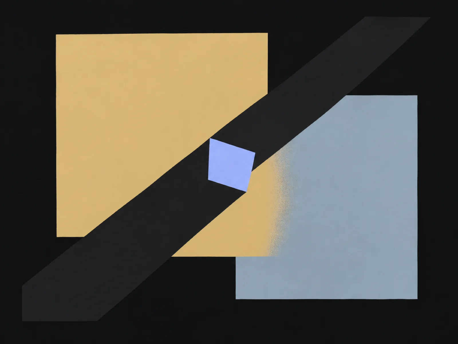
Standing in front of an abstract work can feel like the door has closed: no figure to follow, no story to catch hold of. Tate's definition reframes the problem — abstract art does not attempt to represent an accurate depiction of visual reality, but instead uses shapes, colours, forms and gestural marks to achieve its effect. The subject was never hidden; the materials are doing the work a subject usually does.
That makes abstraction the best possible training ground for the method this site runs on: start with what is actually there, and let interpretation arrive after the description rather than instead of it. “I don't get it” becomes “I can describe it” — and description is where real looking starts. The image at the top of this page is an invented composition made for exactly that exercise, so you can practise on it without worrying about a correct answer.
Start with what's actually there
Give the first minute to the visible evidence and nothing else. Which colours are present, and which covers the most area? Where do edges sit hard against each other, and where do they soften or dissolve? Is there a shape that repeats, or a direction the picture keeps pushing? Say the answers in the plainest possible sentence — “a red field with one dark diagonal” already counts as looking.
The useful frame is “I can see”, not “this is”. “I can see a crowded top edge and an empty lower field” is a fact another person could verify. “This is about loneliness” is an interpretation — worth having, but it belongs a few steps later, once the facts are on the table.
One thing the Tate's definition makes plain: the word covers two different cases. Some works are abstracted from something visible — a figure or a landscape, simplified or schematised until it nearly disappears. Others are built from forms with no source in external reality at all; some artists of this ‘pure’ abstraction preferred terms like ‘concrete art’ or ‘non-objective art’, though in practice ‘abstract’ is used across the board. So “what is it of?” is a fair question — but sometimes the honest answer is “nothing, by design”.
Colour, edge, rhythm: the working vocabulary
Three terms do most of the work. Colour is more than hue: notice temperature (warm passages against cool), weight (a small saturated patch can outweigh a large pale field) and neighbours, because each colour is altered by the one beside it. Edge is how shapes meet — hard and drawn, or soft and lost — and it decides whether a picture feels snapped together or left to drift. Rhythm is repetition: the same mark, colour or direction returning until your eye falls into step with it.
Composition is the umbrella word, and Tate defines it as the arrangement of the elements within a work — how the parts relate to each other and to the whole. Two arrangements are worth naming. A relational composition organises the elements within the canvas border, the tradition that ran from the classical pyramidal groupings onward. Allover composition, which Tate credits to Jackson Pollock in the late 1940s, spreads its incidents across the whole surface without a climax; Barnett Newman's colour blocks of the same period ran off the top and bottom edges of deliberately unframed canvases.
When you stall, pick one of the three and exhaust it. Describing every edge in a picture takes longer than expected, and something always turns up. The looking vocabulary glossary collects more words in the same spirit, each with a picture to check it against.
What the title is doing
Abstract works carry titles like Composition, No. 5, Seascape, or a dedication to a person. Read the title the way the museum label guide treats the wall text: a choice someone made about the work, not a key that unlocks it.
A title can name a subject — Seascape invites you to look for horizon traces — describe a process, honour a person, or deliberately withhold. When it withholds, that is information too: the artist declined to hand you a subject, which is a statement about how the work wants to be met.
So check the title after looking, not before. If it names a subject, go back and ask whether the picture keeps or abandons that promise. When you want firmer footing than a title offers, the record fields — date, medium, collection — are the checkable part, and the catalogue record guide shows how to read them.
Gesture vs geometry: two family trees
Much abstract work leans towards one of two ways of being made. Gesture leaves the hand in the picture: a thrown, dragged or swept mark you can almost re-perform with your own arm. Geometry removes it: measured edges, repeated units, flat colour. The split is not a law — plenty of pictures mix the two — but “made of moves or made of measurements?” is a question that opens nearly every abstract work.
The families have different histories. Tate names Malevich and Mondrian as pioneers of ‘pure’ abstract painting from about 1910–20, and points to the Russian constructivist Naum Gabo as a pioneer of abstract sculpture that took its references from the modern world. The gesture-first wing crested in post-war American abstract expressionism. You do not need the movement names — the visible difference between a swept mark and a ruled edge is the thing that stays with you.
Tate also notes that abstract art is often seen as carrying a moral dimension — order, purity, simplicity, spirituality. Whether a picture feels that way to you is part of the looking, not a test with a correct answer.
Where interpretation earns its keep
Every reading on this site is built in three layers — visible evidence, documented context, interpretation — and on abstract work the first layer does the heavy lifting. An interpretation earns its place by pointing at something specific: “the picture feels tense” is one person's report; “the picture feels tense, and notice how every shape crowds the upper edge while the lower field sits empty” is an interpretation another viewer can test.
Your response is legitimate evidence about what the picture does. Unease, calm, impatience or boredom are data about what the colours and edges are doing to a viewer, not a verdict on whether you are qualified to look.
Documented context still matters where it exists: a museum record for an abstract work carries maker, date, medium and collection just as a portrait's does, and those fields are checkable in exactly the same way.
Try it on a documented example
The illustration at the top of this page is a safe surface — an invented composition with no right answer waiting. Run the moves on it first, then take them to a real work. Guernica sits at the representational edge: Picasso's figures are distorted and flattened towards abstraction, and its example reading shows the same evidence-first moves on a work where there is still something to recognise.
For fully abstract works, the Art Institute of Chicago's open collection is a good browsing pool — its object pages carry the record fields you can check your description against.
Name three colours and one edge. Spend a minute on the image above listing only what is physically there: which colours touch, where a hard edge meets a soft one, which shape holds the most area. No interpretations yet.
Follow the fastest rhythm. Find the element that repeats — a diagonal, a colour, a mark — and trace where it recurs and where the pattern breaks. A break in a rhythm is usually where a picture is doing something deliberate.
Read the title last. If the work carries a title or a record, check it only after your own description. Ask what it adds, what it withholds, and whether you would have named it differently.
Run it on a real work. Pick an abstract work in the Art Institute of Chicago collection (opens in a new tab) or in a gallery, and repeat the same three moves. Five minutes is enough.
Compare with a reading. Photograph the work — or open this guide's illustration — in the scanner, and compare its visible-evidence layer with your notes. Readings here are AI-generated and provisional — a starting point for looking, not a verdict — and the places they disagree with your notes are where the second look lives.
Take another look
The next abstract work you meet, give it the first move before anything else: one colour, one edge, one rhythm. If you want a second pair of eyes on the visible evidence, an AI-generated reading will describe the same surface back — provisionally — and you get to decide where it missed.
Sources
- Abstract art (Tate Art Terms) (opens in a new tab)
- Composition (Tate Art Terms) (opens in a new tab)
- Collection (Art Institute of Chicago) (opens in a new tab)
Definitions and artist references follow the cited Tate art-terms pages; the looking exercises are Art Says Hi editorial guidance. Sources last checked 2026-10-01.
Read a photo of your ownYour photo is only sent when you choose Start reading.
Spotted an error? Tell us